Note
Go to the end to download the full example code.
Qualitative interpretation of ALE statistic maps
This example shows a conservative way to inspect an ALE result when a coordinate-based meta-analysis does not have enough eligible studies for robust voxelwise inference.
I think it’s important to be able to look at descriptive maps without over-interpreting them. The all-or-nothing nature of inferential statistics could lead to a researcher missing a potentially interesting descriptive pattern that they can collect independent data to follow up on. In other words, these descriptions are little “huh” moments that you can keep in your back pocket, and be used as a call to action for future research.
The key choice is to inspect the raw stat map descriptively, instead of
interpreting the z or p maps as evidence. For ALE, the stat map is
the observed ALE convergence value. Larger values indicate stronger descriptive
spatial convergence among the modeled activation maps. They do not, by
themselves, establish statistical significance.
In this workflow:
all reported coordinates are plotted first, so the evidence base is visible;
the ALE
statmap is plotted with a display-only threshold;a jackknife sensitivity analysis is used to ask whether the qualitative pattern depends strongly on one study.
The outputs should be interpreted as a descriptive summary of where coordinates were reported, not as proof of activation or statistically significant convergence.
Load a deliberately small coordinate dataset
The bundled pain Studyset has more studies than we want for this demonstration, so we restrict it to eight analyses to mimic a case where the screened evidence base is too small for robust voxelwise inference.
In a real analysis, the decision that a dataset is too small should be made before looking at the map, using the review protocol and field-specific expectations. The code below is only a demonstration of what to do after that decision has been made.
import os

import matplotlib.pyplot as plt
import numpy as np
import pandas as pd
from matplotlib.colors import ListedColormap, to_hex
from matplotlib.lines import Line2D
from nibabel.affines import apply_affine
from nilearn.plotting import plot_glass_brain, plot_markers, plot_stat_map

from nimare.diagnostics import Jackknife
from nimare.meta.cbma.ale import ALE
from nimare.nimads import Studyset
from nimare.utils import get_resource_path

studyset_file = os.path.join(get_resource_path(), "nidm_pain_studyset.json")
studyset = Studyset(studyset_file, target="mni152_2mm")

qualitative_ids = studyset.ids[:8]
qualitative_studyset = studyset.slice(qualitative_ids)

print(
    "Qualitative subset: "
    f"{len(qualitative_studyset.study_ids)} studies, "
    f"{qualitative_studyset.coordinates.shape[0]} reported coordinates."
)
Qualitative subset: 8 studies, 107 reported coordinates.
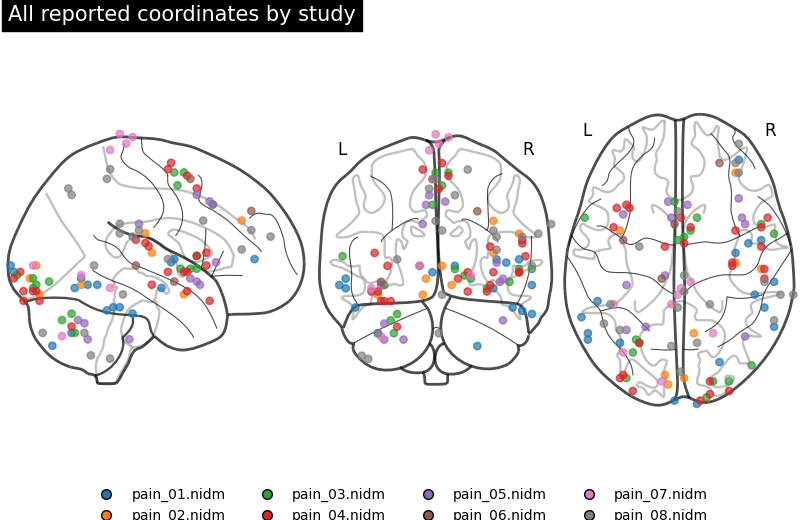
Plot all reported coordinates
Before looking at any meta-analytic map, inspect the coordinates themselves. This plot shows the spatial evidence entering the qualitative synthesis. It is not thresholded and does not perform inference.
coords = qualitative_studyset.coordinates.copy()
study_ids = qualitative_studyset.study_ids.tolist()
study_to_code = {study_id: i_study for i_study, study_id in enumerate(study_ids)}
coords["study_code"] = coords["study_id"].map(study_to_code)
study_colors = plt.get_cmap("tab10")(np.arange(len(study_ids)))
study_hex_colors = np.array([to_hex(study_colors[i_study]) for i_study in coords["study_code"]])
study_cmap = ListedColormap(study_colors)

legend_handles = [
    Line2D(
        [0],
        [0],
        marker="o",
        color="none",
        label=study_id,
        markerfacecolor=study_colors[i_study],
        markersize=7,
    )
    for i_study, study_id in enumerate(study_ids)
]


def add_study_legend(fig):
    """Add the study-color legend below a figure."""
    fig.legend(
        handles=legend_handles,
        loc="lower center",
        ncol=4,
        frameon=False,
        bbox_to_anchor=(0.5, -0.03),
    )


def plot_coordinates_by_study(title):
    """Plot all reported coordinates on a glass brain, color-coded by study."""
    fig = plt.figure(figsize=(8, 5.2))
    plot_markers(
        coords["study_code"].to_numpy(),
        coords[["x", "y", "z"]].to_numpy(),
        node_size=28,
        node_cmap=study_cmap,
        node_vmin=-0.5,
        node_vmax=len(study_ids) - 0.5,
        colorbar=False,
        figure=fig,
        title=title,
    )
    add_study_legend(fig)
    return fig


def add_coordinates_by_study(display, marker_size=12):
    """Add study-colored coordinates to an existing nilearn display."""
    display.add_markers(
        coords[["x", "y", "z"]].to_numpy(),
        marker_color=study_hex_colors,
        marker_size=marker_size,
        edgecolors="black",
        linewidths=0.5,
    )


plot_coordinates_by_study("All reported coordinates by study")
<Figure size 800x520 with 4 Axes>
Fit ALE and inspect only the raw statistic map
ALE.fit also computes p and z maps, but this example does not
interpret them. With too little evidence for robust inference, switching from
corrected results to uncorrected z values would still invite inferential
interpretation. The raw ALE statistic is a clearer descriptive target.
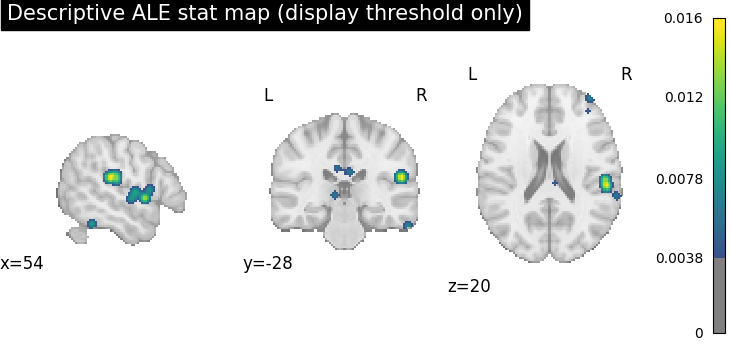
A display threshold is used below only to make the plot readable. It is the 95th percentile of nonzero ALE values and should not be described as a statistical threshold.
meta = ALE()
results = meta.fit(qualitative_studyset)

stat_img = results.get_map("stat")
# getting 1D array to easily compute a percentile (without including all the zeros outside the mask)
stat_values = results.get_map("stat", return_type="array")
nonzero_stat = stat_values[stat_values > 0]
# get the top 5% of nonzero values for display purposes only; this is not a statistical threshold
display_threshold = np.percentile(nonzero_stat, 95)

stat_data = stat_img.get_fdata()
peak_ijk = np.unravel_index(np.nanargmax(stat_data), stat_data.shape)
peak_xyz = apply_affine(stat_img.affine, peak_ijk)

print(
    "Largest descriptive ALE statistic: "
    f"{stat_data[peak_ijk]:.5f} at "
    f"x={peak_xyz[0]:.1f}, y={peak_xyz[1]:.1f}, z={peak_xyz[2]:.1f} mm."
)
print(f"Display-only threshold: ALE stat >= {display_threshold:.5f}")
Largest descriptive ALE statistic: 0.01568 at x=54.0, y=-28.0, z=20.0 mm.
Display-only threshold: ALE stat >= 0.00378
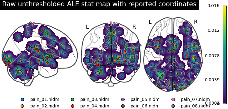
Revisit the coordinates and the raw unthresholded ALE statistic map
The combined glass-brain view overlays the reported coordinates on the raw
unthresholded ALE stat map. The coordinates show the evidence entering the
analysis, while the projected stat map shows how the ALE kernel turns those
coordinates into a smooth descriptive convergence map. Brighter areas indicate
greater local overlap among modeled activation maps. This still does not imply
statistical significance.
glass_display = plot_glass_brain(
    stat_img,
    display_mode="ortho",
    cmap="viridis",
    colorbar=True,
    plot_abs=False,
    symmetric_cbar=False,
    threshold=0.0001,  # show a reasonable amount of the values
    title="Raw unthresholded ALE stat map with reported coordinates",
)
add_coordinates_by_study(glass_display, marker_size=20)
add_study_legend(glass_display.frame_axes.figure)

plot_stat_map(
    stat_img,
    display_mode="ortho",
    cut_coords=peak_xyz,
    draw_cross=False,
    cmap="viridis",
    symmetric_cbar=False,
    threshold=display_threshold,
    title="Descriptive ALE stat map (display threshold only)",
)
<nilearn.plotting.displays._slicers.OrthoSlicer object at 0x784a7a318f70>
Jackknife sensitivity analysis
NiMARE’s Jackknife removes one experiment at a time and
estimates how much each experiment contributes to each cluster.
This is still not statistical inference. The clusters below are defined from the same display-only ALE-statistic threshold used above, plus a descriptive cluster-size filter to keep the table compact. In this example, the voxel-level threshold is the 95th percentile of nonzero ALE-statistic values, so it displays the top 5% of nonzero stat-map voxels.
Larger values mean that removing that experiment produces a larger average reduction in the ALE statistic within at least one descriptive cluster.
jackknife = Jackknife(
    target_image="stat",
    voxel_thresh=display_threshold,
    cluster_threshold=500,
    n_cores=1,
)
diagnostic_results = jackknife.transform(results)

cluster_table = diagnostic_results.tables["stat_tab-clust"]
jackknife_table = diagnostic_results.tables["stat_diag-Jackknife_tab-counts_tail-positive"]

print("Descriptive clusters used for jackknife sensitivity analysis:")
print(cluster_table.head(10).to_string(index=False))

cluster_columns = [column for column in jackknife_table.columns if column != "id"]
jackknife_summary = pd.DataFrame(
    {
        "id": jackknife_table["id"],
        "mean_cluster_contribution": jackknife_table[cluster_columns].mean(axis=1),
    }
)
print("Jackknife contribution summary:")
print(jackknife_summary.to_string(index=False))
  0%|          | 0/8 [00:00<?, ?it/s]
 12%|█▎        | 1/8 [00:00<00:01,  4.25it/s]
 25%|██▌       | 2/8 [00:00<00:01,  4.22it/s]
 38%|███▊      | 3/8 [00:00<00:01,  4.20it/s]
 50%|█████     | 4/8 [00:00<00:00,  4.21it/s]
 62%|██████▎   | 5/8 [00:01<00:00,  4.22it/s]
 75%|███████▌  | 6/8 [00:01<00:00,  4.23it/s]
 88%|████████▊ | 7/8 [00:01<00:00,  4.22it/s]
100%|██████████| 8/8 [00:01<00:00,  4.22it/s]
100%|██████████| 8/8 [00:01<00:00,  4.22it/s]
Descriptive clusters used for jackknife sensitivity analysis:
     Cluster ID     X     Y     Z  Peak Stat Cluster Size (mm3)
 PositiveTail 1  52.0   4.0  -2.0   0.015199               6832
PositiveTail 1a  52.0  -4.0   6.0   0.009670
PositiveTail 1b  36.0   2.0  -2.0   0.009451
PositiveTail 1c  58.0   0.0   0.0   0.009192
 PositiveTail 2   8.0   4.0  58.0   0.015176               9104
PositiveTail 2a  -4.0  20.0  40.0   0.013101
PositiveTail 2b   0.0  10.0  50.0   0.011469
PositiveTail 2c   2.0  -4.0  62.0   0.010419
 PositiveTail 3 -26.0 -66.0 -38.0   0.014101               6320
PositiveTail 3a -36.0 -68.0 -40.0   0.012481
Jackknife contribution summary:
            id mean_cluster_contribution
pain_01.nidm-1                  0.087339
pain_02.nidm-1                  0.045975
pain_03.nidm-1                  0.214195
pain_04.nidm-1                  0.346442
pain_05.nidm-1                  0.177272
pain_06.nidm-1                  0.054589
pain_07.nidm-1                  0.027155
pain_08.nidm-1                  0.045791
Plot sensitivity metrics
High mean values for one study indicate that the displayed descriptive clusters depend more strongly on that study. In that case, the written synthesis should say so directly and avoid presenting the full-data pattern as stable.
fig, ax = plt.subplots(figsize=(8, 4), constrained_layout=True)

jackknife_summary.plot.bar(
    x="id",
    y="mean_cluster_contribution",
    ax=ax,
    legend=False,
    color="#f58518",
)
ax.set_ylim(0, 1)
ax.set_xlabel("Study removed")
ax.set_ylabel("Mean contribution")
ax.set_title("Mean descriptive-cluster contribution")
ax.tick_params(axis="x", labelrotation=45)
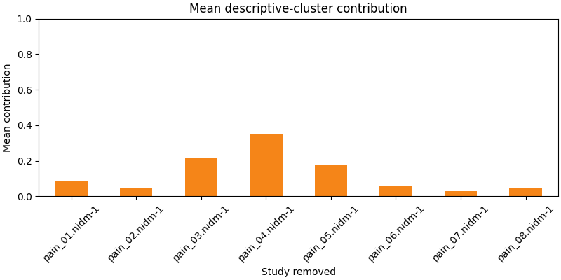
In this case, pain_04.nidm-1 has a mean contribution of 0.4 (40%) across clusters meaning that removing that study reduces the ALE statistic by 40% on average across the identified clusters. This suggests that the descriptive pattern depends more strongly on that study than others, and the written synthesis should say so directly.
Interpretation template
A responsible qualitative interpretation should separate observation from inference. For example:
“The screened evidence base was too small for robust voxelwise inference, so corrected and uncorrected significance maps were not interpreted. The raw ALE statistic map was inspected descriptively. The included coordinates showed the strongest descriptive convergence near the reported peak above, with the map displayed only after applying a visualization threshold. A jackknife sensitivity analysis was used to evaluate whether the displayed descriptive clusters were dominated by a single study. These results summarize where coordinates tended to be reported; they should not be described as statistically significant activation.”
Avoid language such as “significant cluster”, “activation was found”, or “evidence for convergence” unless a valid inferential analysis supports it. Do I sound like a broken record? I hope so, because I want it to be crystal clear that this is a descriptive summary, not an inferential result.
Total running time of the script: (0 minutes 3.984 seconds)